Why Social Distancing Works
Saturday March 14, 2020


Everyone is talking about social distancing, but nobody seems to understand why it works. This is what I wrote for someone on Facebook.
So with any disease, there’s a bunch of metrics associated with how fast and far a disease will spread. Kind of the freshman epidemiology one is called [latex]R_0[/latex], pronounced R-naught. It is the expected value of the number of people an infected individual will pass the infection on to. Things like social distancing, closing schools, etc., have the effect of pushing down [latex]R_0[/latex]. There’s a lot estimates out for the COVID-19 [latex]R_0[/latex], ranging from just over two to just about 2.5. My own models for Hebei just gave up and went home crying.
Now, for comparison, during a normalish year, the [latex]R_0[/latex] of influenza is right about 1.5. Ebola is just about 2. Measles is estimated between 12-18. MERS, from a few years back, was less than 1. Less than 1 means the infection will die out on its own. Anything greater than 1 means it will just keep going until it runs out of people, similar to Larry King with wives. This is the secret to understanding the “flatten the curve” plot.
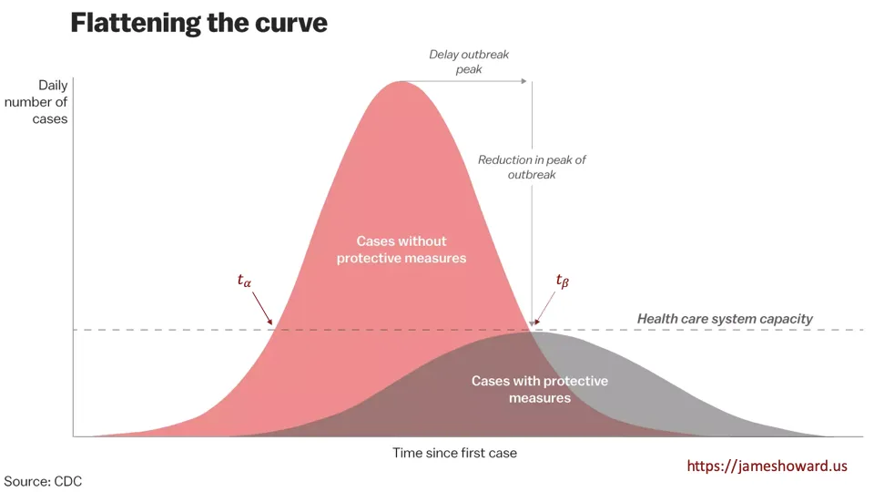
Using the picture above, I have labeled 2 points, [latex]t_{\alpha}[/latex] and [latex]t_{\beta}[/latex], as the two points where the unmitigated curve crosses the dashed line. The dashed line can actually be any value, it is just the hospital carrying capacity in this plot. If that represents [latex]n^\star[/latex] people who are infected, then we can expect in the unmitigated case, those [latex]n^\star[/latex] people to get [latex]n^\star \times R_0[/latex] people infected in the next time step, [latex]t_{\alpha+1}[/latex]. At [latex]t_{\alpha+2}[/latex], it is [latex]n^\star \times R_0 \times R_0[/latex], and this is how exponential growth works. At the peak of the curve, it starts running out of people and the epidemic begins starving. Note, that only half the infected people over time are infected at this point. Life is still going to suck.
In the flattened curve, as I said, the effective [latex]R_0[/latex] is reduced. Let’s call it [latex]R_0^\prime[/latex], but for this discussion, also assume it is still above 1. The flattened curve touches the dashed line at [latex]t_{\beta}[/latex]. This is still [latex]n^\star[/latex] people infected. After this point, at [latex]t_{\beta+1}[/latex], we can expect [latex]n^\star \times R_0^\prime[/latex] people to be infected. And at [latex]t_{\beta+2}[/latex], we can expect [latex]n^\star \times R_0^{\prime} \times R_0^{\prime}[/latex] to be infected.
This is where we get into hopes and dreams. This chart is aspirational. The objective is to push the peak of the curve, where the epidemic starts to starve, under the dashed line. This is about keeping the hospitals from overflowing. If this curve we actually drawn to scale, the area under the left half of each curve, representing total infections, would be the same. But there’s also a practical aspect that the lower [latex]R_0[/latex] is, the lower the peak is anyway and fewer people get sick, since we actually do not have perfect mixing within the population, which would allow everyone an equal chance of contact with an infected individual.
But we have to remember, [latex]R_0^\prime[/latex] is only an effective value. As soon as we all start playing in the sandbox again, it goes back up to its true value. There are more permanent mechanisms for driving down [latex]R_0[/latex], and those are vaccines. This chart is about protecting hospitals. The real goal should be to push the starvation point out passed the point where some magic threshold number of individuals are immune, due to either recovery or vaccination. That is probably between 70 and 85 percent of all people, assuming 100 percent immunity from prior contact or vaccination.
In practice, these curves both are jagged and have longer tails. The model is a tool for understanding reality, not reality itself. But it provides quite a bit of insight into how social distancing can work. But you can probably skip the face mask.