How to Design a Tartan
Thursday May 15, 2025

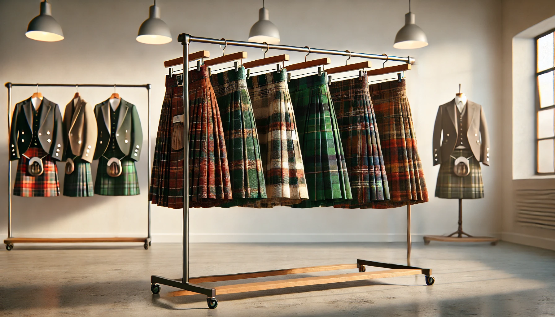
Tartans carry the weight of tradition. They are imagined as ancient patterns, clan-bound, Highland-tested, and restricted to those who can trace their ancestry back to some moor or glen. The popular image is rigid: each tartan linked to a specific family, protected by obscure rules, and authorized only by long-dead chiefs or living heralds. This is myth, not law.
In truth, tartans are governed by structure, not ancestry. The tartan of the Royal Stewart is no older than the British Empire. The “official” clan tartans we recognize today are largely creations of the Victorian revival. Many tartans were invented in the 20th century. Others are being registered every week: tartans for astronauts and archdioceses, tech companies and towns. There is a Maryland state tartan. There is one for Yellowstone National Park. Anyone can design one, and people do.

Tartan does not have to be complex. The most stripped-down example is the classic check—a pattern built from just two colors and no symmetry beyond simple repetition.
Consider this sett: K100 W100. That is 100 threads of black (K for key, the traditional color code for black), followed by 100 threads of white. The same sequence is used in both warp and weft. The result is a bold grid: black squares where black crosses black, white where white crosses white, and soft grey at the intersections.
This basic pattern is often called the Check. It is instantly recognizable, structurally perfect, and a reminder that tartan is not about ornament. Add a red pinstripe, and you are halfway to something iconic. But even alone, it stands.
More than that, tartans are everywhere. Open Amazon and search “sweaters for men.” In the first few results, you are likely to find something described as having a “tartan lining,” even if the garment is manufactured in Vietnam and sold under an Italian brand. Department stores use “plaid” and “tartan” interchangeably, plastering variations of the same crossed-line grid over shirts, scarves, slippers, and upholstery. This is not dilution; it is diffusion. Tartan has become a visual language as common as pinstripes or polka dots. Its symbolic power persists even when divorced from clan or country.
What makes a tartan a tartan is not its backstory but its form. A tartan is a system of colored stripes, repeated and mirrored, forming a grid of visual rhythm. It is defined not by how it looks but by how it is constructed: a thread count and color sequence that can be read, recorded, reproduced, and worn. Designing one is not an act of artistic inspiration alone, it is a matter of proportion, contrast, symmetry, and purpose. It is a form of semiotic design, a woven grammar of identity.
This post is a guide for those who want to understand that grammar. We will begin with the structural rules that define tartans, how to read and write a sett, and then move on to designing one yourself. Whether you are crafting a tartan to mark an occasion, inventing a pattern for a fictional world, or simply curious about the logic behind that scarf in your closet, this is your introduction.
At its core, a tartan is a system. It is not simply a pattern of stripes, nor a generic plaid. A tartan is defined by structure, specifically, a repeating sequence of colored threads, woven both vertically (warp) and horizontally (weft), to create a grid of intersecting lines and layered color fields. What distinguishes tartan from similar patterns is the logic behind its construction.
The fundamental unit of that construction is the sett: a defined sequence of colors, each assigned a number of threads. The sett is a data structure, not an image. It determines how the fabric will be woven and, by extension, how the tartan will look when worn or displayed. The final appearance, whether bold and angular or soft and muted, is a result of this underlying information.
In most cases, the tartan pattern is symmetrical. That means the sequence of colors and thread counts mirrors itself outward from a central pivot. A symmetric sett might read something like: blue, green, black, green, blue. This mirroring is not merely aesthetic; it produces a centered, stable rhythm in the pattern. When repeated across the fabric, it generates the familiar visual balance seen in most Highland dress tartans.
By convention, the warp and weft are typically identical: the same sett is used in both directions of the weave. This is a key feature of tartan, and it means that each color stripe in the warp crosses each stripe in the weft, forming a matrix of combinations. Where two stripes of the same color intersect, blue on blue, for example, the result is a solid square. Where two different colors cross, say, red and green, the threads interlace and the color appears blended to the eye. These blended areas are not specified directly in the sett; they are a consequence of the weaving process and a defining feature of the tartan aesthetic.
There are also asymmetric tartans, which do not mirror around a central pivot. In these, the sett runs in a continuous, repeating sequence without reversal. Asymmetric designs are rarer and can feel more modern or dynamic, but they follow the same structural rules: a defined sett repeated in both directions. In asymmetric tartans, the warp and weft remain the same, but the lack of symmetry creates a more varied and less centralized pattern.
In all cases, what makes a tartan recognizable is this system of repetition. Tartan is not defined by color alone, nor even by visual impression. It is defined by structure, proportion, and recurrence. It is not an image to be drawn, but a pattern to be executed, repeated, mirrored, and woven into cloth.
To design a tartan, you must first learn how to write one. Tartan is not drawn freehand; it is specified. Its definition lives in numbers and codes, not pixels or fabric swatches. The core of this specification is the thread count, a formal description of the sequence of colors and the number of threads assigned to each. This is the language in which tartans are created, recognized, and reproduced.
A typical thread count notation might look like this:
G24 B4 G24 R6 G24 B4 G24
Each letter refers to a color (G for green, B for blue, R for red, etc.),
and the number following it indicates how many threads of that color are woven
before transitioning to the next. This sequence defines the sett, the
fundamental unit of the tartan pattern, which is then repeated both vertically
and horizontally to fill the cloth.
The sett is read outward from a central pivot, usually located at the narrowest
or most distinctive stripe. In the example above, the pivot lies on the R6,
with the same sequence appearing in reverse on both sides. This produces a
symmetrical design, in which the pattern reflects itself horizontally and
vertically. Such symmetry is the default assumption for most tartans unless
stated otherwise.
Because symmetry is so common, many tartans are written in symmetrical
shorthand, also known as center-to-selvedge notation. In this format, only
half of the sett is written, with a slash (/) indicating that the sequence
will be mirrored. For example:
R/4 G/8 B/4
This means four threads of red, then eight of green, then four of blue, after
which the pattern reflects itself in reverse: G8 R4, completing the mirror
image. When woven with the same sequence in both warp and weft, this creates the
familiar balanced grid of intersecting colors that defines tartan.
In this shorthand, the slash is not mathematical, it is a marker of symmetry. So
R/6 means that six threads of red will appear before the pivot, and another
six after, with the pivot located at the boundary. Some tartans use a doubled
center stripe (e.g., Y12) to function as a central axis; others have a single
central line. Either is acceptable, so long as the mirroring is unambiguous and
consistent.
The pivot is thus the anchor of the design. It gives the tartan its structural and visual center. Placing the pivot at a stripe of high contrast or narrow width draws the eye and helps orient the sett. Good design tends to build outward from this point, using rhythm and repetition to create coherence.
Some tartans, however, reject symmetry altogether. These are known as asymmetric
tartans, and their setts repeat continuously without reversal. Instead of
mirroring, the pattern simply cycles forward: A B C D A B C D, and so on. The
warp and weft are still typically defined identically, but the absence of
symmetry creates a pattern with forward momentum rather than balance. Asymmetric
tartans are legitimate, and some are strikingly beautiful, but they are harder
to design well. They require intentional rhythm and careful spacing to avoid
visual drift or imbalance.
Whether symmetric or not, the actual thread counts are scale-relative. A sett
with R4 G8 B4 produces the same proportions as R40 G80 B40, the only
difference is size. The former might appear on a tie or scarf; the latter on a
full kilt or blanket. What matters is the ratio between the stripe widths, not
the raw numbers. This proportionality gives designers flexibility: one can draft
a sett in low numbers for clarity, then scale it up or down as needed for
weaving or printing.
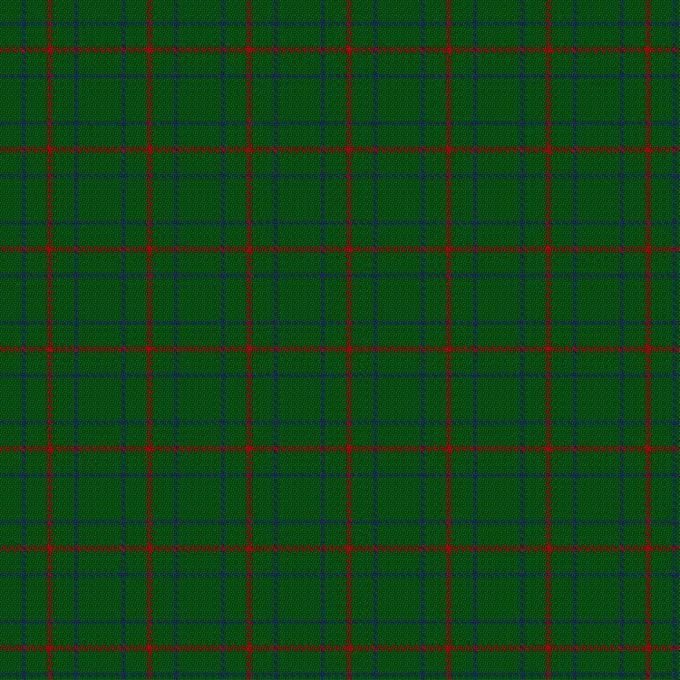
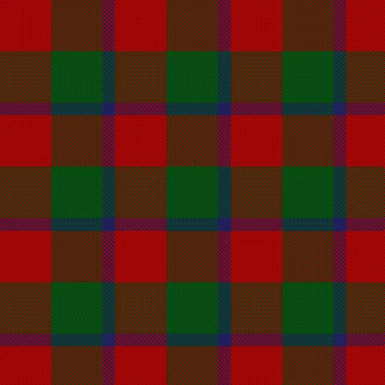
Thread count defines the structure of a tartan, but color defines its identity. And not just which colors you choose, but how those colors are rendered. In traditional Scottish tartan weaving, most tartans have several recognized color variants: modern, ancient, weathered, and sometimes muted. These are not separate tartans, they are stylistic treatments of the same thread count.
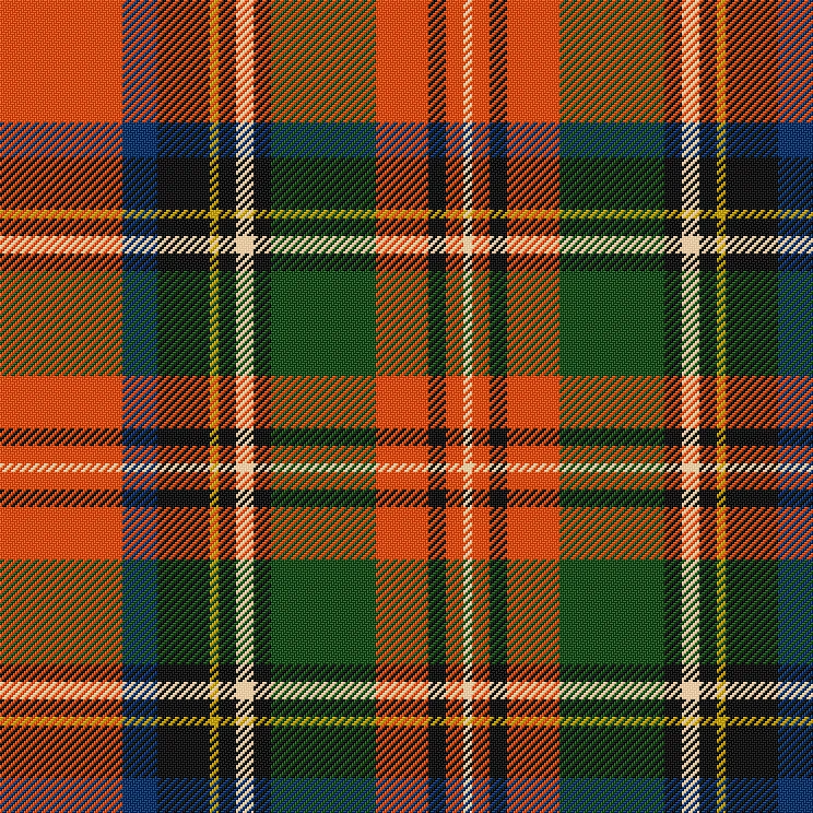
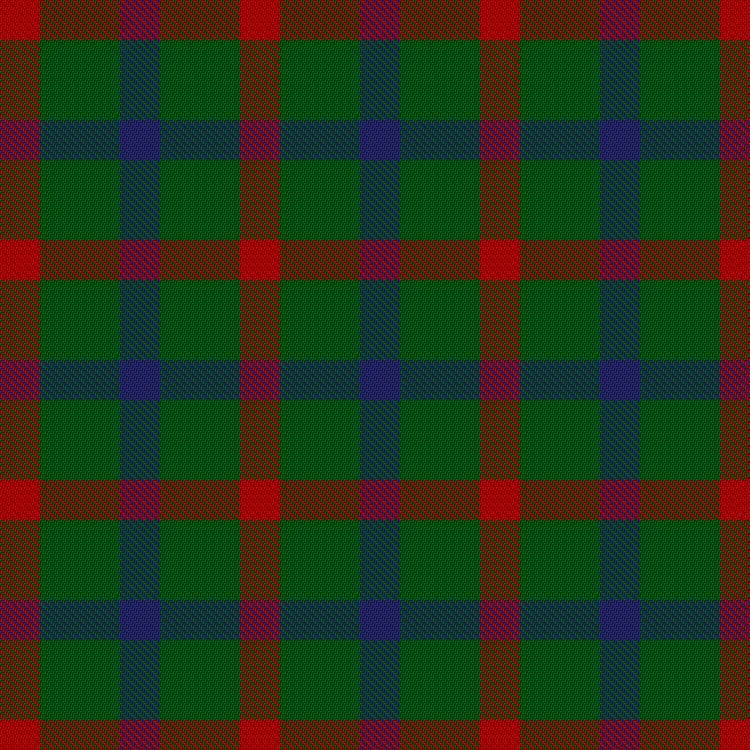
The tartan of Prince Charles Edward Stuart offers a perfect study in how color variants reshape perception without touching structure. The sett remains constant—red dominant, with green and black overchecks and fine white accents—but each treatment tells a different story.
In modern colors, the tartan is bright, proud, and martial. The red is vivid, the green deep, the white stark. It is the tartan of pageantry—cut for formal kilts and royal receptions. You can practically hear the pipes. In ancient colors, the red softens to coral and the green leans toward lichen. The boldness is tempered. This version feels worn-in, not worn-out—like a remembered past, not a preserved relic. It looks less like a prince in exile, more like a rebel in the field. In weathered, the transformation is dramatic. Red becomes rust, green becomes slate, and black becomes stone. It looks not just faded but unearthed. This is the Bonnie Prince of myth—tattered, hunted, and gone. In muted, the tartan becomes contemplative. The red is wine-dark, the green is olive, and the whole pattern feels grounded and reserved. This is a tartan for quiet loyalty, not loud allegiance.
Same sett. Same thread count. Four moods. A single prince refracted through color and time.
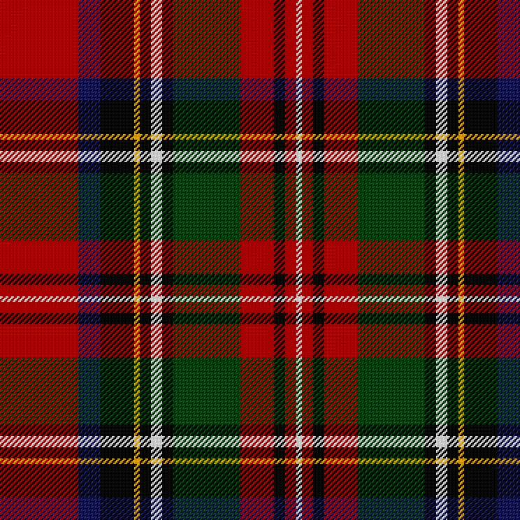
Critically, these are presentation styles, not changes to the sett. The underlying thread count and pattern remain the same; it is only the color rendering that changes. For example, the Black Watch tartan, one of the most widely worn in the world, is available in modern, ancient, and weathered colorations. All three are equally “correct”; the choice is aesthetic, contextual, or personal.
If you are designing your own tartan, you do not need to commit to a variant immediately. You can sketch or simulate the sett in one version, and then explore what it looks like rendered in ancient or weathered tones. But you should design with contrast in mind: ancient and weathered palettes reduce the color distance between stripes, and a pattern that reads cleanly in modern colors might become too muddy or faint when desaturated. Color variant is not just a filter, it can affect legibility.
Think of these variants as modes of interpretation, like a piece of music played on different instruments. The notes are the same, but the character changes.
Once you understand how a tartan is structured, its sett, its thread count, and its color relationships, you can begin designing one of your own. This is where the artistry enters: selecting colors, assigning weights, and shaping the visual rhythm of the pattern. But good design is never arbitrary. The best tartans, like the best flags or coats of arms, mean something. They are structured symbols, not abstract decorations. So start not with colors or numbers, but with intent.
Ask yourself what this tartan is for. This single question will guide every decision you make. Is it a commemorative tartan, marking an event, a date, or a life? Is it personal, a symbolic weave of your family, values, or memories? Is it geographic, representing a place you love or call home? Is it corporate or institutional, meant to be worn by members of an organization? Or is it satirical, thematic, or part of a fictional setting?
Examples help. A tartan for a science fiction novel might use silver, black, and deep red to suggest technology and risk. A tartan for a coastal town could feature navy blue, sand, and seafoam green. A tartan commemorating a lost loved one might use a black mourning stripe intersecting with a pale, hopeful gold.
You are not just designing a pattern. You are encoding a statement.
Once you know the purpose, choose your colors. Most tartans use between three and six distinct colors. Fewer is often better. Each added color multiplies the number of cross-color blends, making the pattern harder to read and more difficult to balance. A good palette includes:
Color choice may be symbolic (red for courage, green for nature), geographic (matching a state or municipal flag), heraldic (using tinctures from a coat of arms), or emotional. Tartan design tolerates meaning well.
Keep in mind that tartan is woven, not printed. That means adjacent colors will blend optically at their intersections. Avoid putting similar hues (like olive and forest green) next to each other unless you are intentionally seeking subtlety. Dark on dark and light on light can work, but only when deliberate.
Good tartan design is about contrast and balance. Try to include at least one dominant stripe, a color that appears in wide bands and helps define the character of the sett. Then add a secondary stripe or accent to create tension and rhythm. Between these, you may place bridging colors that ease transitions.
Think in terms of visual weight:
Use alternating dark and light stripes to preserve clarity and movement. Too many midtones will turn the sett to visual mush. You want the grid to breathe.
Most tartans are symmetrical, and for good reason. A central pivot and mirrored structure give the pattern a sense of order, intentionality, and stability. Unless you have a specific reason to do otherwise, begin with a symmetrical design.
Consider the sett G4 R32 G4 R8 K128 N8 K8 N32 K32 R8. This is a textbook example of an asymmetric tartan. There is no central pivot, no mirroring point—just a continuous sequence of stripes flowing from one to the next. The pattern moves forward rather than balancing inward. The long run of black (K128) dominates the visual rhythm, while the lighter neutral and red elements provide contrast and punctuation. The lack of symmetry gives the tartan a directional quality, more kinetic than centered. It does not settle; it progresses.
If you choose to go asymmetric, do it with care. A pattern that repeats without mirroring can look contemporary, aggressive, or off-kilter. That may be what you want. But in the absence of a pivot, the burden of balance falls entirely on contrast and repetition. Asymmetric tartans often feel more kinetic than ceremonial. Think of Dress Stewart or some of the fashion house designs: bold, stylish, but not solemn.
If you are designing a tartan for use in a formal or historical context, symmetry will almost always serve you better.
Now you assign numbers to your colors. This is where the design becomes a specification.
Use narrow counts, between 2 and 6 threads, for pinstripes and detail accents. These are often best placed near wider bands, to create crisp boundaries or flashes of color.
Use wide counts, between 24 and 60 or more, for dominant stripes. These control the rhythm and overall balance of the sett.
Avoid giving every stripe the same width; it creates monotony. Instead, aim for variation in scale, not just in color. A well-designed tartan has a kind of visual syncopation, like musical phrasing in textiles.
Remember: the actual thread count is relative. A thread count of R6 G12 B6 has
the same proportions as R30 G60 B30, just at a different scale. What matters
is the ratio, not the absolute size.
A sett does not live in isolation, it repeats. Before committing to a design, tile your sett both horizontally and vertically. This will give you a simulated view of the full cloth. Many online tartan designers can do this, or you can mock it up in any vector graphics tool with a grid and repeat.
Ask yourself:
Even in digital preview, you should get a sense of the cloth as worn: how it drapes, how it moves, how it would look across a sash or kilt.
Some designs that look great on paper fall apart when repeated. Others that seem underwhelming in isolation bloom when mirrored and tiled. The key is to test at scale.
In sum: good tartan design begins with meaning, proceeds through proportion, and ends in pattern. It is an act of construction, not inspiration. You are not painting, you are composing. You are writing a code of color and sequence, to be repeated and woven and worn.
Designing a tartan is both artistic and technical. Fortunately, a range of digital tools can help you visualize and refine your sett before it ever touches fabric. These tools allow you to preview the full pattern, adjust proportions on the fly, and export the design in a format that can be shared, printed, or woven.
Two web-based tools stand out:
For higher-fidelity mockups or print-ready versions, consider:
With any of these tools, remember to preview the sett not just as a stripe sequence, but as a tiled grid. A tartan only comes to life when repeated.
Once you are happy with the design in color, convert it to grayscale. This simple step is one of the most powerful diagnostic tools in visual design. Stripped of hue, the tartan’s contrast structure is laid bare. If all the stripes collapse into a dull soup of similar tones, your pattern lacks dynamic range.
Grayscale checking is especially important if your tartan will be used in contexts where color is constrained:
A good tartan should retain its identity and rhythm even in monochrome. Grayscale is a quick way to ensure that.
Even well-intentioned tartans can stumble. Here are a few traps to watch for:
Lastly, translate your digital sett to real-world proportions. Most tartan is
woven at 24–30 threads per inch (tpi). That means a stripe 6 threads wide will
be just a quarter-inch across. Pinstripes (2–4 threads) may disappear entirely
unless rendered in high contrast. Conversely, a 60-thread stripe could span
two inches and dominate the whole garment.
Ask yourself:
This is especially important if your tartan will be worn in motion or seen at a distance. Fabric behaves differently than pixels. It creases, folds, stretches, and catches light. A tartan that looks crisp on screen might go limp when pleated.
To get a feel for scale, print your design at 1:1 on paper. Tile it out to simulate a full sett. Better still, print it on fabric if you can, even iron-on transfer paper on cotton can tell you more than a hundred digital mocks.
Designing a tartan is not just a creative exercise. It is a negotiation between geometry, contrast, and context. Digital tools can get you close, but only testing will tell you whether the pattern holds up when repeated, woven, worn, and seen.
Once your tartan is complete, sett structured, colors selected, proportions balanced, you may want to give it a permanent home. That means registration, and there is a formal way to do it.
The Scottish Register of Tartans (SRT), maintained by the National Records of Scotland in Edinburgh, serves as the official global archive of tartan designs. It is not a private company or a symbolic gatekeeper. It is a national record, open to anyone, regardless of heritage.
Registration is not required, but it offers something valuable: recognition. Once your tartan is recorded in the register, it becomes part of the public landscape. It exists in a structured, permanent, and searchable form. Others can cite it, reproduce it, and respect it as a finished work, not just a concept or a cloth sample in a drawer.
It also provides clarity. When you register a tartan under your name, or your family, or your organization, that claim is recorded. No one else can register a tartan under the same name without your consent. This is not intellectual property in the commercial sense, but it is a form of identity protection. It ensures that your pattern stands distinct in the archive, tied to your intent and authorship.
And perhaps most importantly, registration preserves. The SRT is a cultural memory bank, a public ledger of design and meaning. Long after the fabric fades or the designer passes, the tartan remains, visible, referenced, and remembered. It joins the collective pattern of the Scottish diaspora, of commemorative design, and of the ever-expanding symbolic vocabulary of cloth.
To register your tartan, visit the Scottish Register of Tartans and begin an application.
You will need to provide:
Turnaround time is usually a few weeks, and staff may reach out for clarification if anything in your application is ambiguous.
The name of your tartan should be unique, unambiguous, and appropriate to its purpose. Here are some typical forms:
Avoid overly generic names like Pride, Victory, or Tradition. These are likely to be rejected or require additional justification. The goal is clarity and distinctiveness. You want your tartan to be identifiable in a list, not lost among dozens with similar names.
Tartan design is not fashion. It is not ornament. It is form, proportion, and purpose, a structured language that speaks in rhythm and line. A good tartan is not just pleasing to the eye; it is legible to the mind. It signals identity, memory, affiliation, and intent. Every stripe has a reason, every intersection a consequence.
And you do not need a drop of Scottish blood to participate. The mythology of tartan may be Highland, but its logic is universal. Designing a tartan does not require ancestry. It requires clarity of vision, respect for the medium, and a willingness to think in structure. The best tartans are not the loudest, they are the ones with something to say.
When you get it right, a tartan becomes more than fabric. It becomes part of the symbolic landscape, recognizable, repeatable, and wearable. It can mark an event, a family, a place, a dream. It can exist in wool, in pixels, in ink. And it will last as long as someone remembers the pattern and passes it on.
So choose your colors. Set your threads. Build your rhythm. Write your identity in stripes.