Stop Making 3D Plots
Wednesday August 12, 2015


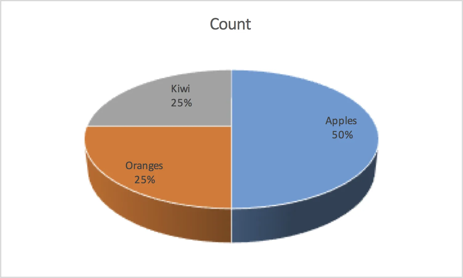
FlowingData gave a list of charting rules to follow. I disagree with one, in that pie charts are never acceptable because it is difficult to perceive the differences in size between one pie chart and another. This is especially true in 3D plots. Take this plot, for instance:

In this plot, despite the fact there are an equal number of oranges and kiwi (25), the oranges section of the plot is about twice as large as the kiwi section. Think of it in these terms: When a plot is printed, a good plot will use twice as much ink to represent a value twice as large and use the same amount of ink to represent the same value.
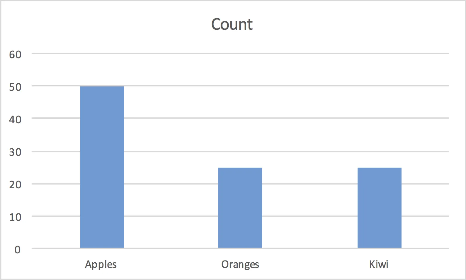
This is often a problem I see when teaching the statistical portion of Finite Mathematics or statistics. During the plotting portion, students will try to make fancier and fancier graphics, and that just doesn’t help the case. So turn off the 3D and avoid the pie chart. There’s nothing a pie chart can do a bar chart doesn’t do better:

Image by Randall Munroe / xkcd…now that’s an effective use of ink.